
ESIC Nursing Officer-7July 2024
Nursing Research & Statistics
Easy
The following diagram is indicative of 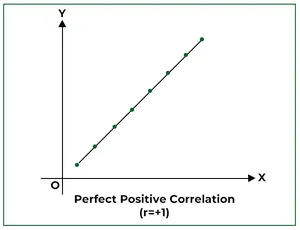
Appeared in: ESIC Nursing Officer-7July 2024
Explanation
- The diagram shows a perfect positive correlation, where all data points lie on a single straight line.
- The line slopes upwards from left to right, indicating that as the value of the X-axis variable increases, the value of the Y-axis variable increases proportionally.
- This type of relationship has a correlation coefficient (r) of exactly +1, as stated in the image label.
- In a perfect positive correlation, there is no variation or scatter of data points away from the trend line.
Why Other Options Were Wrong
- Option A: A weak negative correlation would show data points loosely scattered in a downward trend from left to right. The provided image shows a perfect upward trend.
- Option B: A strong negative correlation involves points tightly clustered around a line sloping downwards. The image shows an upward slope.
- Option D: A moderate positive correlation would show points scattered around an upward-sloping line, not perfectly on it. The image shows no scatter at all.
Related Visual

- Visual 1: Diagram - A scatter plot showing a perfect negative correlation (r = -1), with all points on a downward-sloping line.
- Visual 2: Diagram - A scatter plot showing a moderate positive correlation, with points trending upwards but scattered around a line of best fit.
- Visual 3: Diagram - A scatter plot showing no correlation (r = 0), with points scattered randomly with no clear pattern.
Clinical Relevance
- Nursing practice connection: This is primarily an exam-oriented knowledge point with limited direct bedside application, so retain Interpretation of a scatter plot diagram to determine the type of correlation between two variables as background academic context rather than a clinical decision trigger.
- Understanding correlation is fundamental in nursing research to analyze relationships between variables, such as the link between hours of sleep and patient recovery rates, or diet and blood pressure levels.
- Nurses can use this concept to interpret research findings and apply evidence-based practice. For example, if a study shows a strong positive correlation between a specific nursing intervention and improved patient outcomes, it provides evidence to support that intervention.
- What if? - If the points in the diagram were still trending upwards but were scattered loosely around the line, the answer would change to 'Moderate positive correlation'. This would imply that while the two variables are related, other factors also influence the outcome.
How to Approach the Question
- First, observe the overall direction of the data points on the scatter plot. In this case, they move from the lower-left to the upper-right, which indicates a positive relationship.
- Next, assess the 'scatter' or spread of the points. Notice that all points lie perfectly on a single straight line, with no deviation.
- Combine these observations: a positive direction and no scatter means a 'perfect positive' relationship.
- Finally, read any labels on the diagram. The text explicitly states 'Perfect Positive Correlation (r=+1)', which directly confirms the visual analysis and leads to the correct option.
Concept Tested & Keywords
- Concept Tested: Interpretation of a scatter plot diagram to determine the type of correlation between two variables.
- Stem keywords: diagram, indicative of, correlation
- Lead-in keywords: BEST, MOST RELEVANT CLUE
- Negative lead-in flag: false
Question ID
QE6v-Kp1uWm6rURmn3UrY-
Practise the full ESIC Nursing Officer-7July 2024
Attempt every question from this paper in a timed mock, then review the full solution for each one.
More ESIC Nursing Officer-7July 2024 Questions
- Which one of the following hormones is secreted by neurohypophysis that causes uterine contractions?
- Which of the following conditions can cause Steatorrhea? 1. Pancreatic enzyme insufficiency 2. Diseases affecting small intestines 3. Bile acid defic…
- All of the following are theories of motivation EXCEPT
- The highest level of growth needs as per Maslow's hierarchy of needs theory is
- An IQ score of 90 is classified as
- According to Sigmund Freud's theory of Psychoanalysis, all of the following are structures of personality EXCEPT
- The conflict that occurs due to having to choose between two positive goals which are equally attractive at the same time is called
- The type of family in which father has highest status in family who controls the social life of family is called
- Which of the following are ways of Acculturation? 1. Trade and commerce 2. Industrialization 3. Education 4. Conquest
- Which of the following are essential amino acids? 1. Leucine 2. Tryptophan 3. Methionine 4. Cystine 5. Histidine